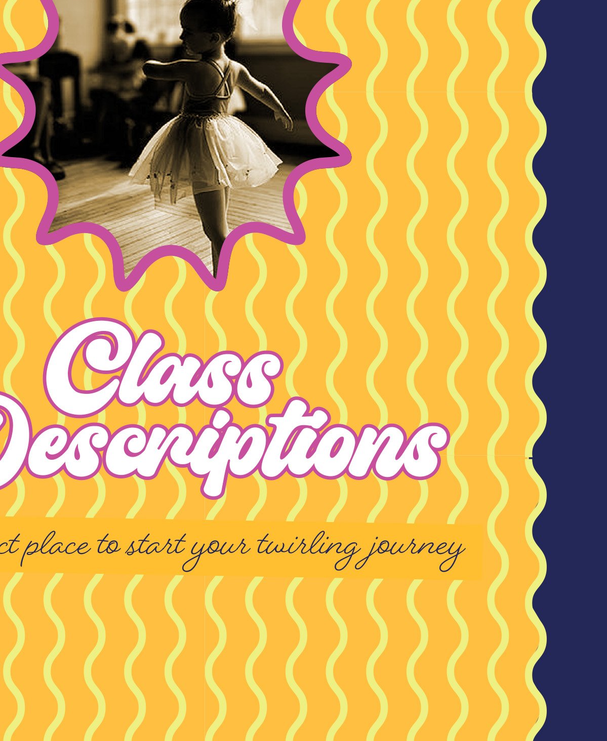
Brittany was a competitive twirler for over 20 years, and opened her own baton twirling and dance studio focusing on coaching and training her students with core values known as guiding stars so they build up positive characteristics and skills learned through baton twirling and dance in order to be successful in the real world.
After starting up her brand herself she had gotten to the point of wanting a rebrand that truly reflected her values. She wanted something built around the same values she’s instilling in her girls… having fun, building friendships, working hard to achieve goals and dreams, learning and building life skills, all while teaching proper technique and skills and providing inspirational coaching and cutting edge artistry.
BC Majorettes
Services:
Logo Design & Branding
Brand Identity
Brand Guidelines
ASPIRATIONAL. FUN. VIBRANT. INVITING. CONFIDENT.
To establish a fun yet distinctive presence that would speak to Brittany’s target age (5-7) but also still respect the skill, commitment and dedication to the craft, there’s a youthful vibe that still feels grounded and fluid for growth. It feels like it could be the dream board for a younger or older girl while also making her mom nostalgic and bring a bright smile to her face. Hitting both sides of that equation in the aesthetics built a great foundation that keeps in mind the present and potential growth and expansion in the future.
A VIBE THAT FEELS LIKE SUMMER AND COLORFUL DAYS SPENT IN THE SUN
The vibe and energy, with a hint of retro spin, speaks to the inner child and feels like summer and colorful days spent in the sun. You just feel happier looking at it! These feelings speak to the joyful personality and positive attitude of Brittany’s ideal client and their moms. There’s a strength also to the build of the typography. The shadow provides a solid foundation to the fun curve of the lettering. The twirling baton is used as the cross in the two “t’s” which gives us a clever way to add in a core element. Being an integral part of the build of the word “Majorettes” reinforces the foundation she’s building upon. The retro vibe offers a unique identifier in her space and gave a lot of room to play with color and creative expression.
A BIT OF VINTAGE. A WHOLE LOT OF ENERGY!
Cute, fun, creative and distinctive with a bit of vintage and a whole lot of energy! The primary and secondary palette allows her to really lean into the more youthful, playful side of the brand and can be used strategically different as the focus audience age increases. To really showcase how the energy can work together I chose a variety of patterns that can work together to show the exuberance and life. The vintage photo starburst elements and fonts bring in that retro energy that still keeps things fun and adding in modern elements and scripts to make sure that we don’t forget our older audience.
VIEW MORE
Branding
& Marketing
Celebrations &
Event Design
& Thought Leadership
Videos
