FLANIGAN ADVISORY
Finding the visual language hidden in the words.
Brand Strategy • Brand Identity • Creative Direction • Visual Systems

SHE GAVE ME THE WORDS. I FOUND THE CONNECTION.
Kiely came to me with a deeply considered vision for the business she wanted to build—who she wanted to serve, how she wanted to guide them and what she wanted Flanigan Advisory to stand for.
There was already plenty of meaning there. My job was to find the visual relationships inside it.
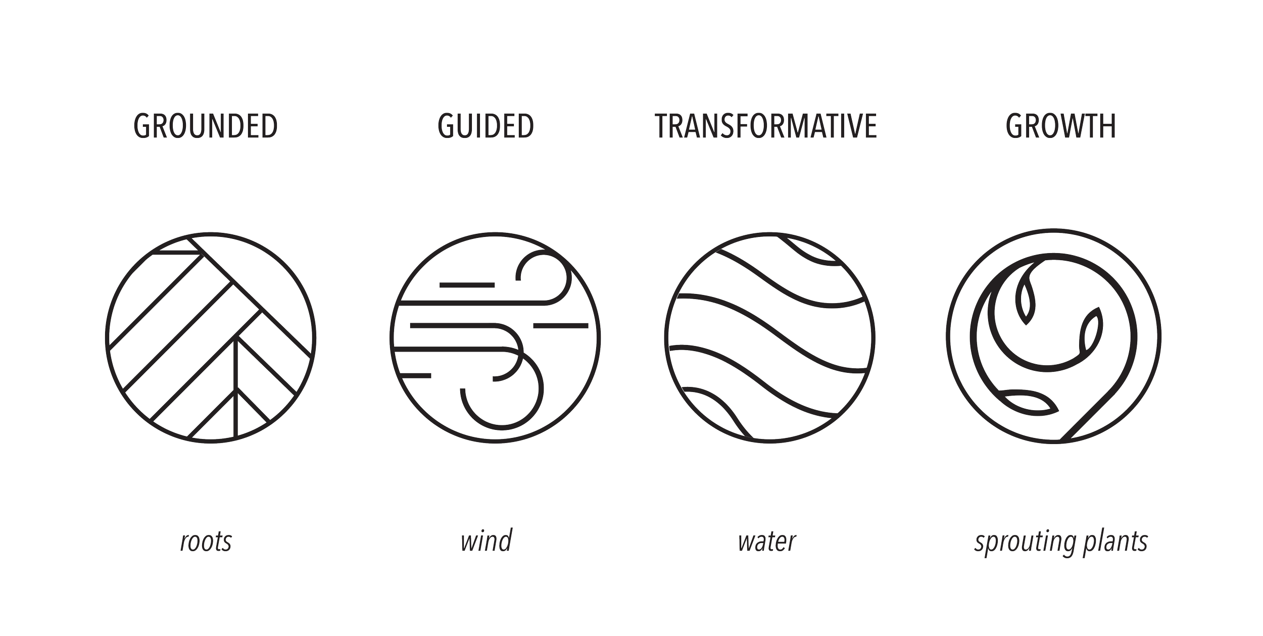
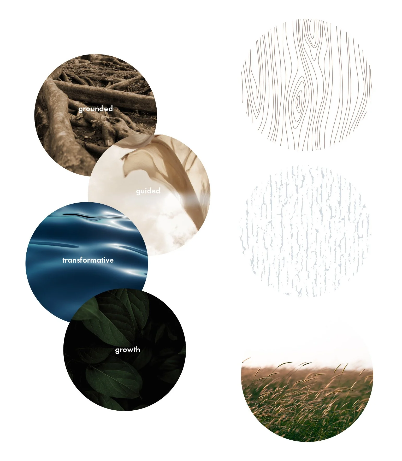
As I dug into everything she’d shared, a few ideas kept surfacing: grounded. guidance. transformation. growth. Together, they became my starting point for translating how Flanigan works into a visual language.

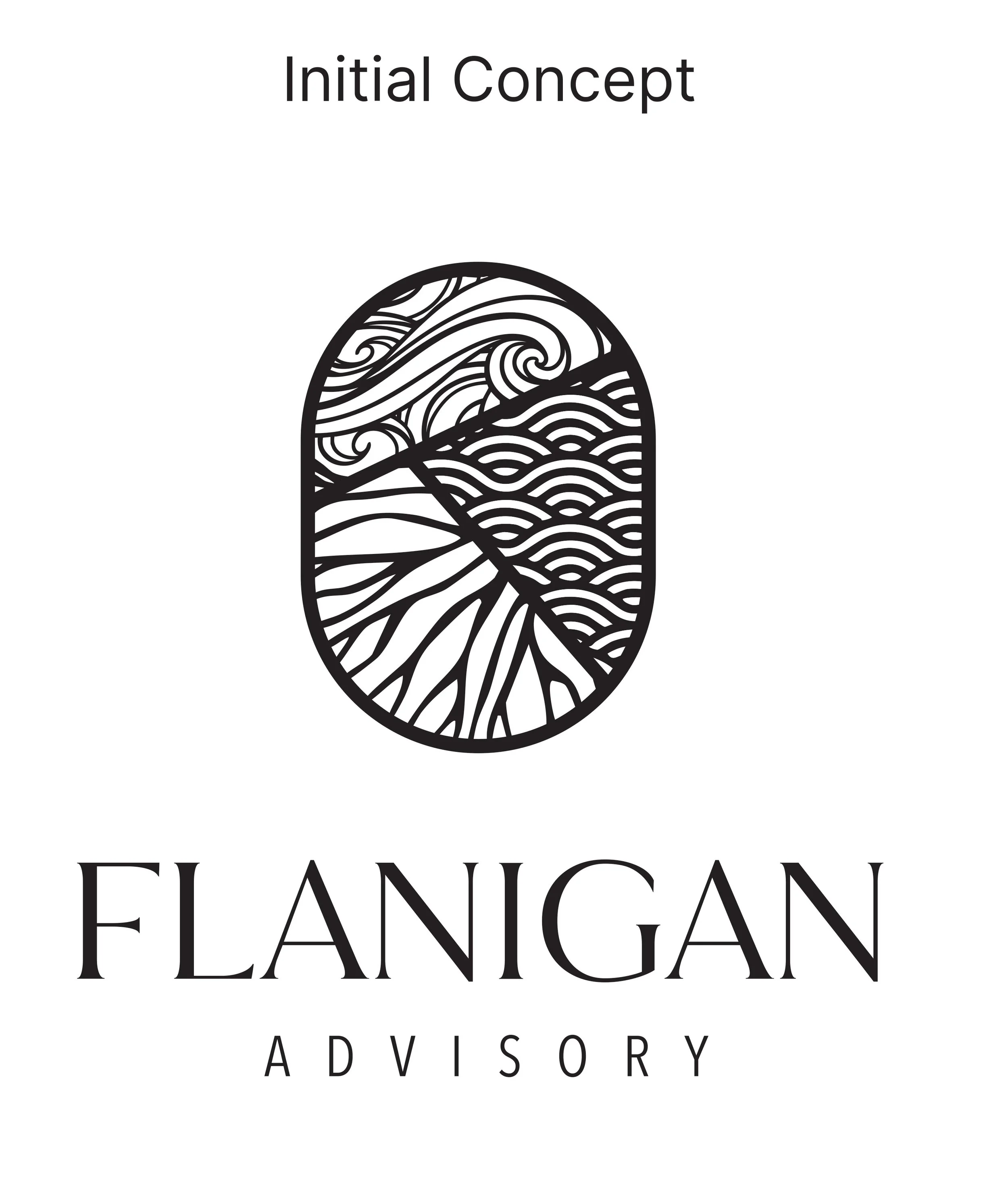
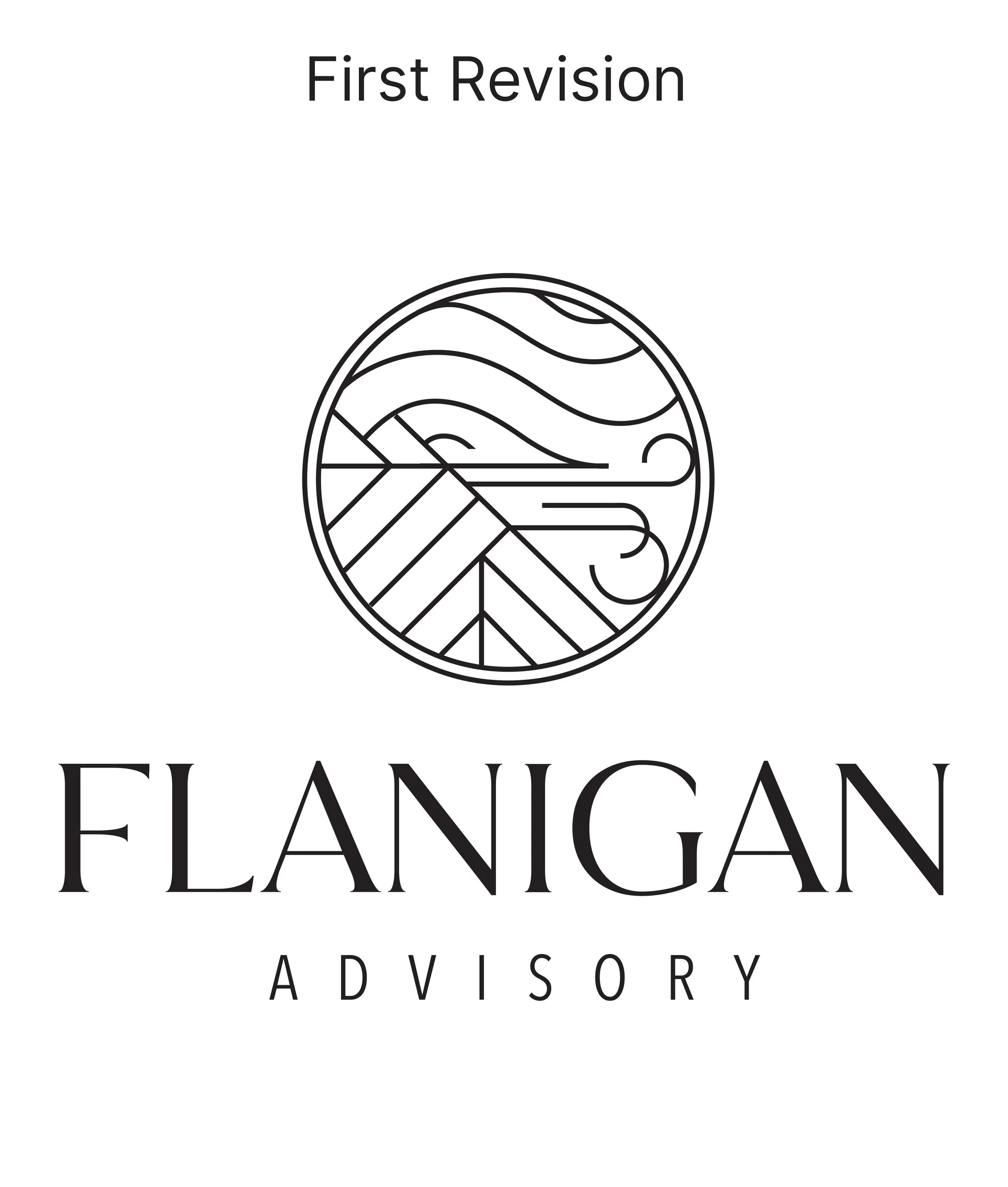
THE THINKING STAYED. THE EXPRESSION EVOLVED.
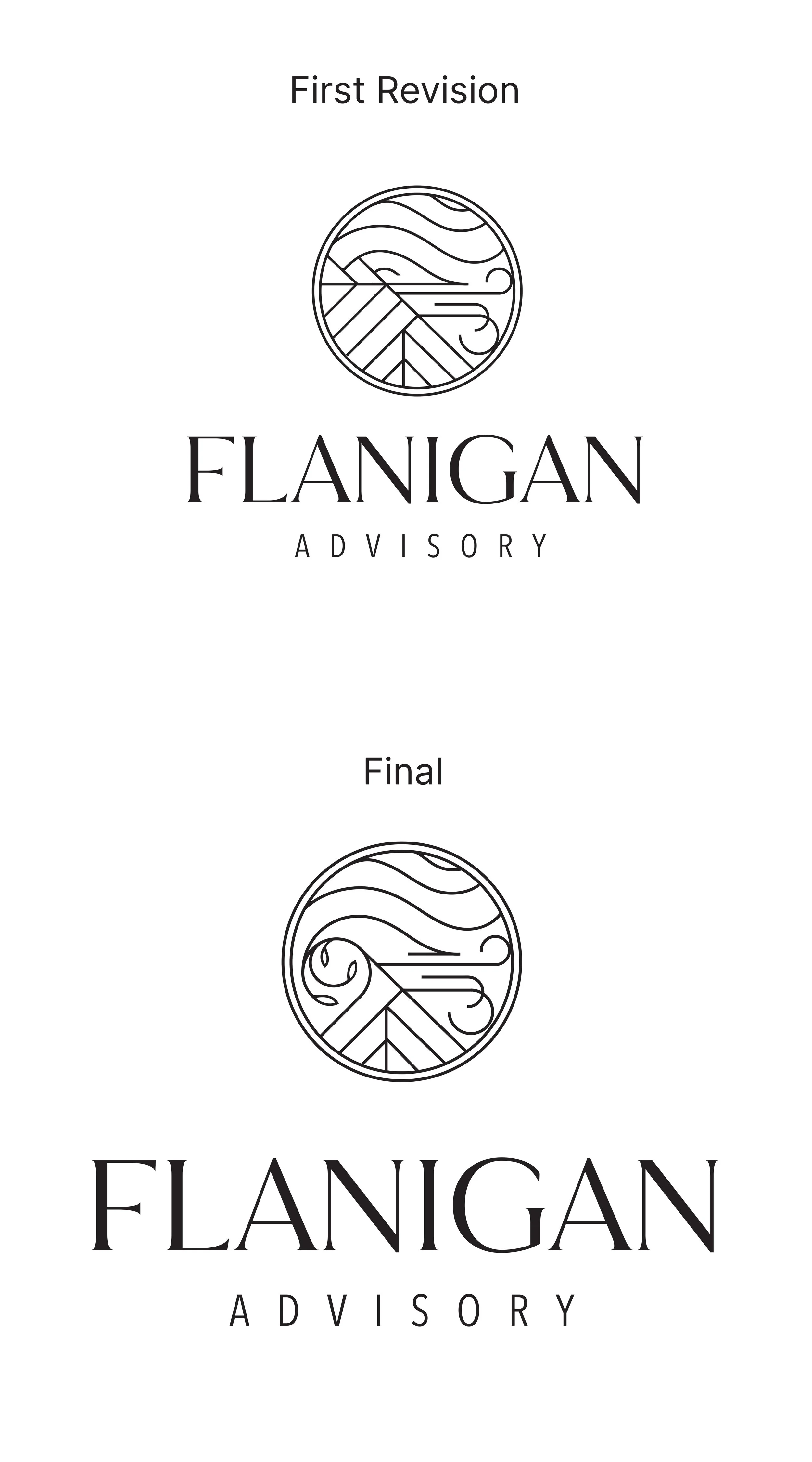
The first concept brought those ideas to life, but Kiely wanted the brand to feel more refined.
So I kept the thinking and changed how it showed up.
GROWTH WAS BUILT INTO THE SYSTEM. LITERALLY
As the system evolved, growth became the fourth idea. But instead of creating another standalone symbol, I built it from pieces of the others.
The lines forming growth borrow from roots, wind and water—because growth isn’t separate from what comes before it. It’s what happens because of it.
ONE IDEA. A WHOLE LANGUAGE.
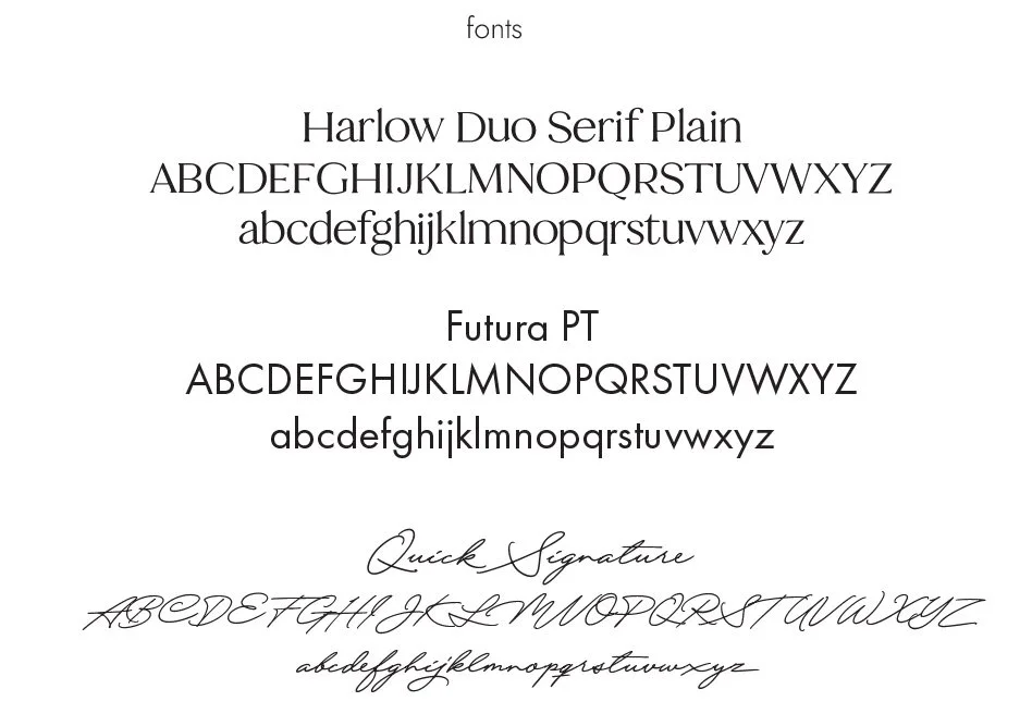
Once the concept was established, the natural elements could extend far beyond the logo—into photography, texture, typography, color and individual moments throughout the brand.
The result feels refined enough for the rooms Kiely needed to enter without losing the warmth and humanity at the heart of how she works.












“This is it! WOW! My heart fluttered when I saw this one. I don’t even need to marinate. I love it, Patrice. I really love the interconnectedness of the design elements and buds. So cool!”
Kiely Flanigan
Founder, Flanigan Advisory