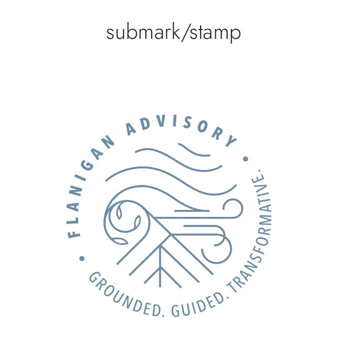
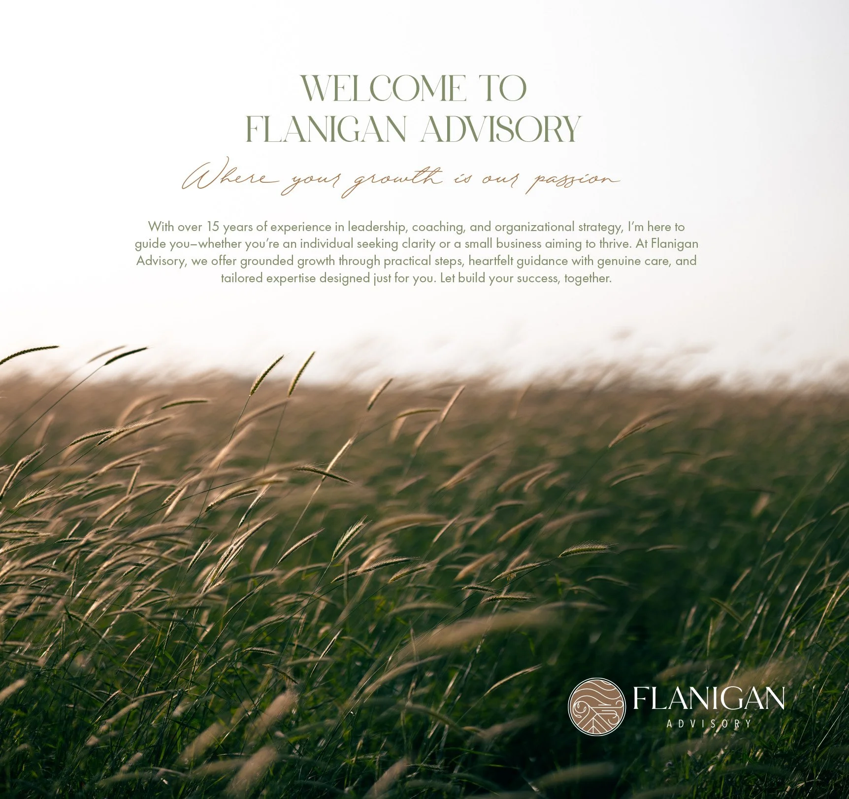
Flanigan Advisory
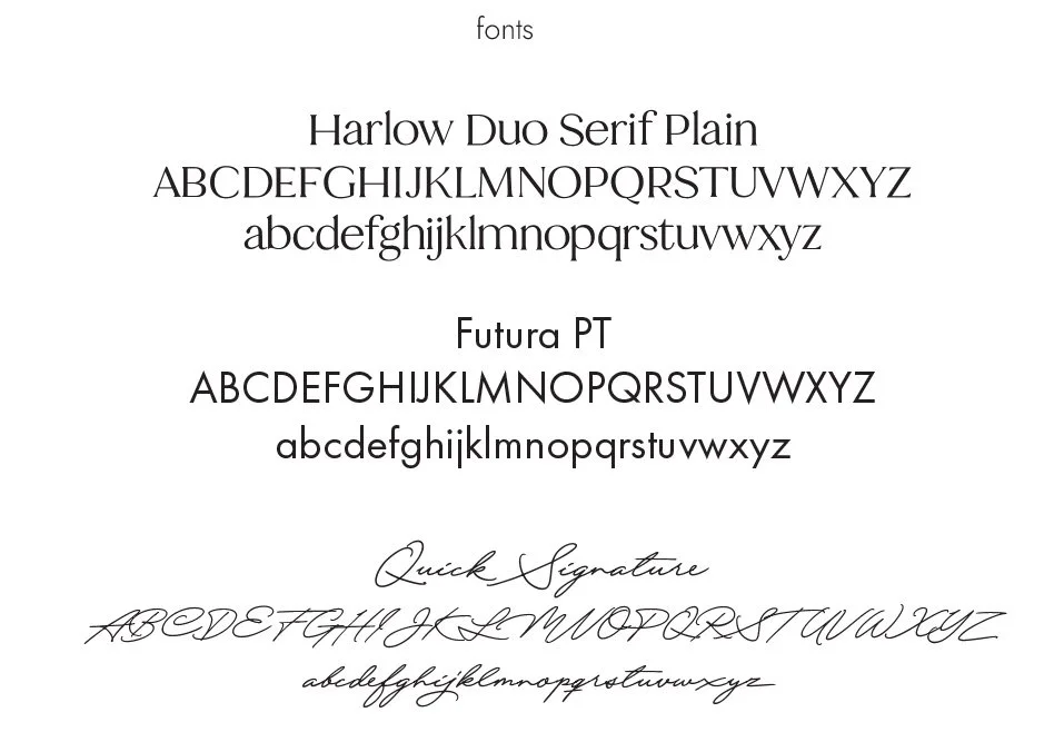
Creative Direction & Brand Identity DesignA brand identity designed to support grounded growth, clarity, and personal transformation.
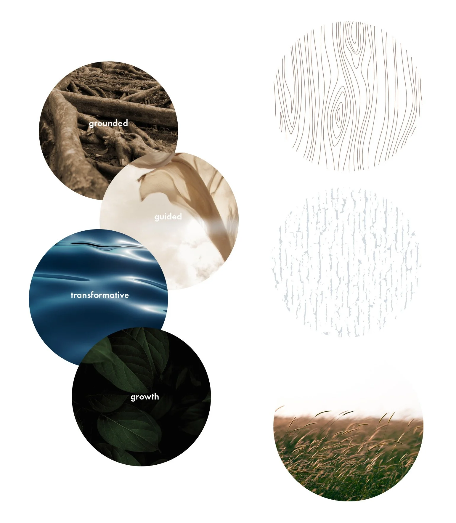
Rooted in coaching and mentorship, the visual system draws from natural rhythms — guidance, flow, and stability — to create a brand that feels steady, intentional, and deeply human.
COACHING BRAND / PERSONAL GROWTH + MENTORSHIP


PROJECT NOTES:
• Creative direction and full brand identity system development
• Designed to support coaching, mentorship, and grounded personal growth
• Built to feel grounded, approachable, and transformational